CoRubrics launches new version. Fixes detected errors and adds a new option. Now allows you to display the results in radar charts.
One of CoRubrics’ weaknesses was sending the results to the students. It was difficult for young students, especially in primary school, to understand the numbers in the rubric. This new version includes the option to also send a radar chart.
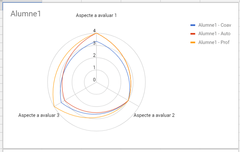
A radar chart is nothing more than a type of graph, in the form of a circle. Each aspect evaluated is indicated outside the circle and inside there is a line. If this line coincides with the outer circle, it indicates that the maximum score has been obtained in all aspects. If any of them do not have the maximum score, the line is no longer a circle and enters in the circle.

This type of graph allows you to easily incorporate more lines and show co-evaluation, self-evaluation and teacher evaluation in the same graph. In the example, you can see how the three evaluations are very much the same. At a glance, the student can see that aspect 2 needs to be improved the most.
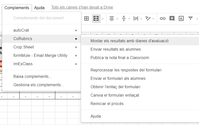
These graphs can be viewed by the teacher, with a new option appearing in the menu once the data has been processed.

This option will create a new sheet, called Radar, that shows all the graphs, one per student or group evaluated.
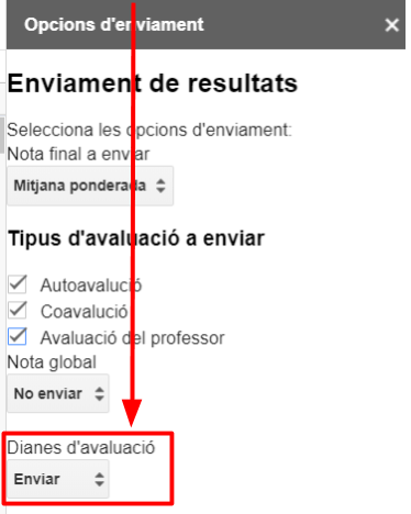
Students can also view your graph if, when results are submitted, the option to submit it is checked.

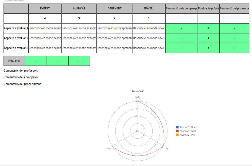
The mail they receive still contains the rubric, but at the end the graphic is added. The Google Sheets and Gmail API is not perfect and the chart is not identical to the one in the spreadsheet, but the data it displays is the same.

The functionality is retroactive, so you can use it with any CoRubrics sheet you have already created.
I hope this functionality will help students better understand assessment with rubrics. In this way the evaluation will tend to be formative, which, for me, is the objective of the evaluation.


